A central question in transportation research and practice involves assessing how the accessibility benefits of transportation systems and projects are distributed across different socioeconomic and demographic groups. Transportation equity concerns are fundamentally related to two types of issues: (1) accessibility inequality and (2) accessibility poverty. In this section you will learn how to use the {accessibility} package to calculate different indicators of accessibility inequality and poverty.
In a recent paper, we discussed the advantages and disadvantages of various inequality and poverty metrics most commonly used in the transport literature (Karner, Pereira, and Farber 2024) - ungated PDF here. The slides below give a very short summary of some ideas discussed in the paper. Just enough to follow this workshop section. Nonetheless, I would strongly recommend reading the whole paper.
In this section, we’ll be using a couple sample data sets for the city of Belo Horizonte (Brazil), which come with the {accessibility} package. In the code chunk below, we read the travel time matrix and land use data, and calculate the average number of jobs accessible in 30 by public transport.
library(accessibility)library(ggplot2)library(dplyr)# path to datadata_dir <-system.file("extdata", package ="accessibility")# read travel matrix and land use datattm <-readRDS(file.path(data_dir, "travel_matrix.rds"))lud <-readRDS(file.path(data_dir, "land_use_data.rds"))# calculate threshold-based cumulative accessaccess_df <-cumulative_cutoff(travel_matrix = ttm,land_use_data = lud,opportunity ="jobs",travel_cost ="travel_time",cutoff =30 )head(access_df)
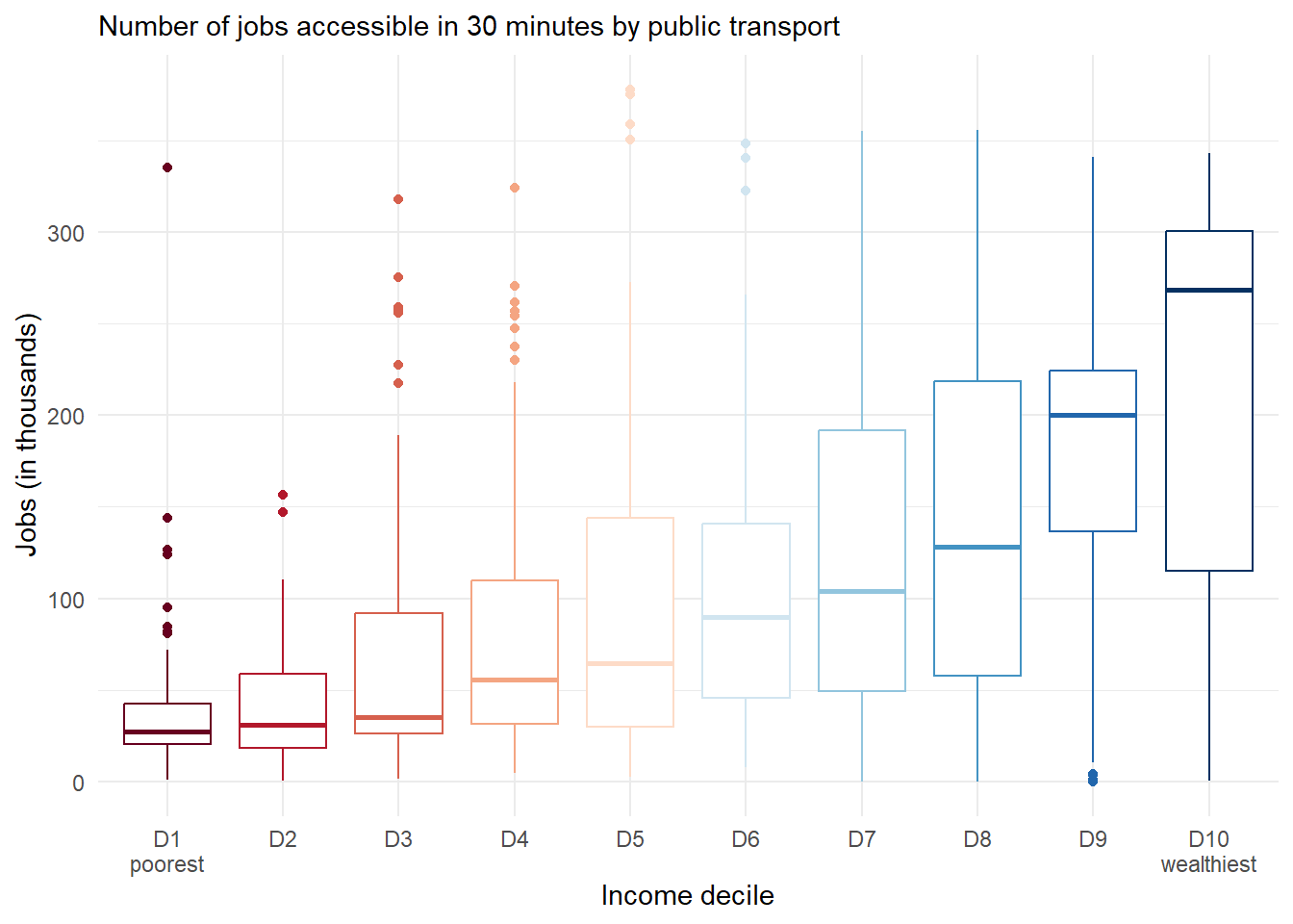
🔎 Time for a quick visual inspection! We can merge our accessibility results with the land use/population data, and visualize how employment accessibility is distributed across different income groups.
# merge acces and land use datadf <- access_df |>rename(jobs_access = jobs) |>left_join(lud, by='id')# remove spatial units with no populationdf <-filter(df, population >0)# box plotggplot(data = df) +geom_boxplot(show.legend =FALSE,aes(x = income_decile, y = jobs_access /1000, weight = population, color = income_decile)) +scale_colour_brewer(palette ='RdBu') +labs(subtitle ='Number of jobs accessible in 30 minutes by public transport',x ='Income decile', y ='Jobs (in thousands)') +scale_x_discrete(labels =c("D1\npoorest", paste0("D", 2:9), "D10\nwealthiest")) +theme_minimal()
The box plot shows a very uneven distribution of access to job opportunities. Now let’s check what we can learn about accessibility inequality and poverty in this region with a few examples.
A detailed explanation of all inequality and poverty measures covered in {accessibility} are available in the package documentation.
Inequality measures
Palma ratio
The Palma ratio is calculated as the average access of the richest 10% divided by the average access of the poorest 40%. Palma Ratio values higher than 1 indicate that the wealthiest population has higher accessibility levels than the poorest, whereas values lower than 1 indicate the opposite situation.
In the example here, we see that the wealthiest population can access on average 3.8 times more jobs than the poor population.
The concentration index (CI) estimates the extent to which accessibility inequalities are systematically associated with individuals’ socioeconomic levels. CI values can theoretically vary between -1 and 1 (when all accessibility is concentrated in the most or in the least disadvantaged person, respectively). Negative values indicate that inequalities favor the poor, while positive values indicate a pro-rich bias.
The fgt_poverty() function calculates the FGT metrics, a family of poverty measures originally proposed by Foster, Greer, and Thorbecke (1984), and which that can be used to capture the extent and severity of poverty within an accessibility distribution. The FGT family is composed of three measures:
FGT0: it captures the extent of poverty as a simple headcount - i.e. the proportion of people below the poverty line;
FGT1: also know as the “poverty gap index”, it captures the severity of poverty as the average percentage distance between the poverty line and the accessibility of individuals below the poverty line;
FGT2: it simultaneously captures the extent and the severity of poverty by calculating the number of people below the poverty line weighted by the size of the accessibility shortfall relative to the poverty line.
This function includes an additional poverty_line parameter, used to define the poverty line below which individuals are considered to be in accessibility poverty. For the sake of this exercise, we’ll consider the lowest 25th percentile of access as our poverty line, which in this example is approximately 23 thousand jobs.
Quick reminder that the definition of an accessibility poverty line is ultimately a moral and political decision and not simply an empirical or technical question (Pereira, Schwanen, and Banister 2017; Lucas et al. 2019).
# get the 25th percentile of accessquant25 <-quantile(access_df$jobs, .25)poverty <-fgt_poverty(accessibility_data = access_df,sociodemographic_data = lud,opportunity ="jobs",population ="population",poverty_line = quant25 )poverty
FGT0: 14.8% of the population are in accessibility poverty
FGT1: the accessibility of those living in accessibility poverty is on average 5% lower than the poverty line
FGT2: it has no clear interpretation, but one could say that the overall poverty level/intensity is 2.8%.
References
Foster, James, Joel Greer, and Erik Thorbecke. 1984. “A Class of Decomposable Poverty Measures.”Econometrica 52 (3): 761–66. https://doi.org/10.2307/1913475.
Karner, Alex, Rafael H. M. Pereira, and Steven Farber. 2024. “Advances and Pitfalls in Measuring Transportation Equity.”Transportation, January. https://doi.org/10.1007/s11116-023-10460-7.
Lucas, Karen, Karel Martens, Floridea Di Ciommo, and Ariane Dupont-Kieffer. 2019. Measuring Transport Equity. Elsevier.
Pereira, Rafael H. M., Tim Schwanen, and David Banister. 2017. “Distributive Justice and Equity in Transportation.”Transport Reviews 37 (2): 170–91. https://doi.org/10.1080/01441647.2016.1257660.