Here are a few quick examples to illustrate how you can use the {aopdata} package to map the spatial distribution of activities and urban services in Brazilian cities.
Download land use data
df <- aopdata::read_landuse(
  city = 'Fortaleza',
  year = 2019,
  geometry = T,
  showProgress = F
)
Spatial distribution of jobs
ggplot() +
  geom_sf(data=df, aes(fill=T001), color=NA, alpha=.9) +
  scale_fill_distiller(palette = "YlOrRd", direction = 1) +
  labs(title='Spatial distribution of jobs', fill="N. of jobs") +
  theme_void()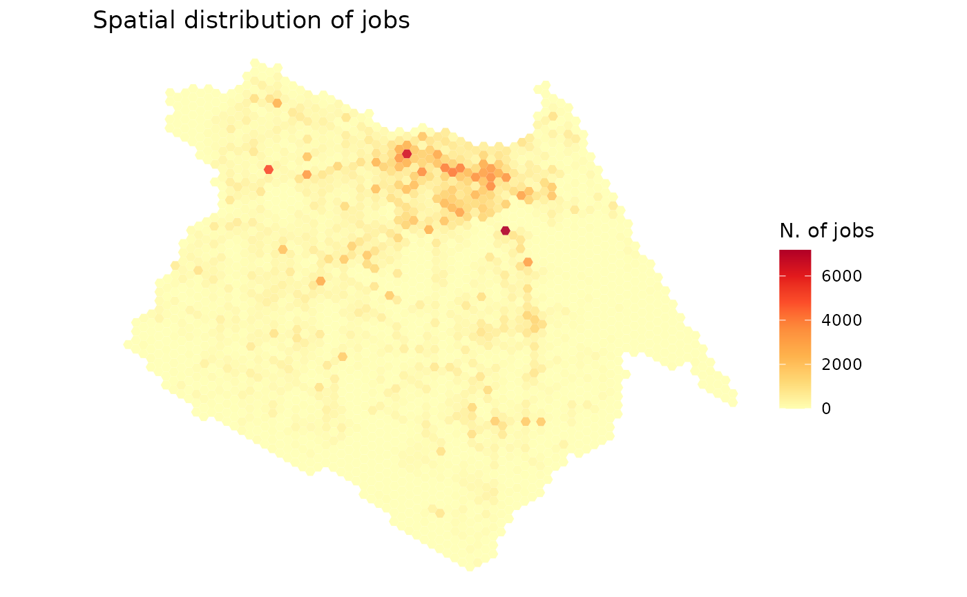
Spatial distribution of schools
In this case below, elementary schools with the
columnE003.
ggplot() +
  geom_sf(data=df, aes(fill=factor(E003)), color=NA, alpha=.9) +
  scale_fill_brewer(palette = "PuBuGn", direction = 1) +
  labs(title='Spatial distribution of elementary schools', fill="N. of schools") +
  theme_void()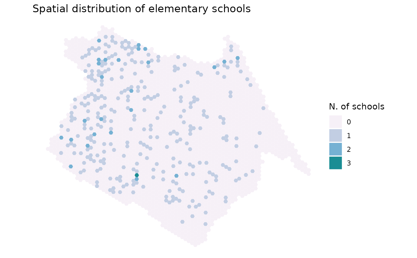
Spatial distribution of healthcare
In this example, we mape high-complexity health care facilities
(column S004).
ggplot() +
  geom_sf(data=df, aes(fill=factor(S004)), color=NA, alpha=.9) +
  scale_fill_brewer(palette = "YlGnBu", direction = 1)+
  labs(title='Spatial distribution of hospitals', fill="N. of hospitals") +
  theme_void()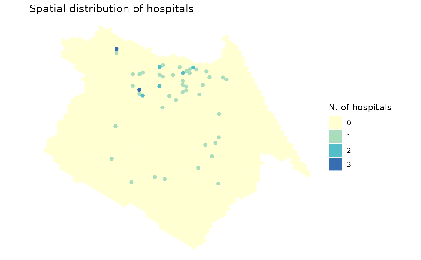
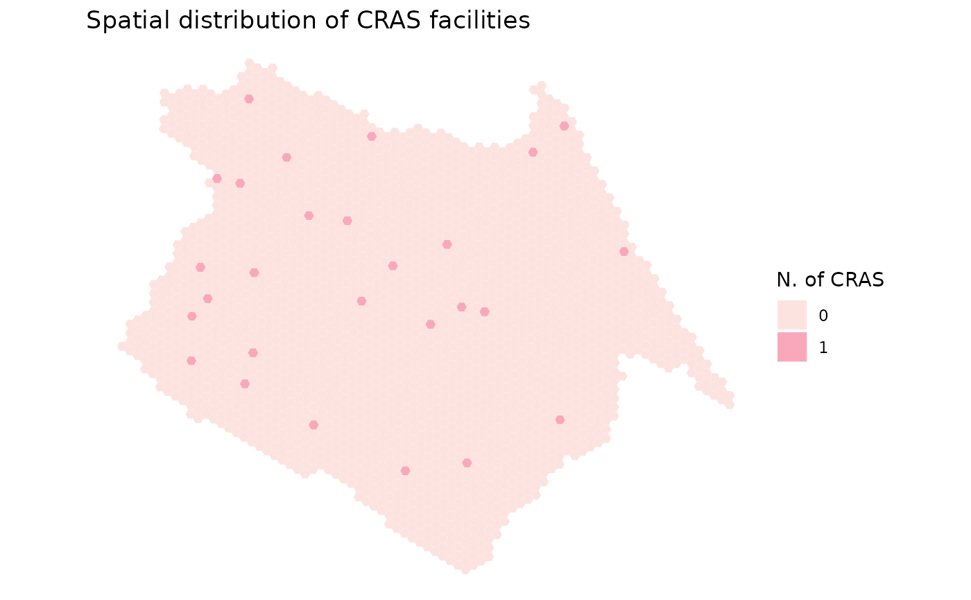
Map Centers for social assistance (CRAS)
ggplot() +
  geom_sf(data=df, aes(fill=factor(C001)), color=NA, alpha=.9) +
  scale_fill_brewer(palette = "RdPu", direction = 1)+
  labs(title='Spatial distribution of CRAS facilities', fill="N. of CRAS") +
  theme_void()